Rewst Styleguide
Logos
Overview
The Rewst logo is a sacred part of our brand. Because of that, it’s imperative that we protect it and use it correctly. To preserve the integrity of our identity, we want to ensure that our branding is always recognizable, legible, and stands out against any competing design elements.
Construction
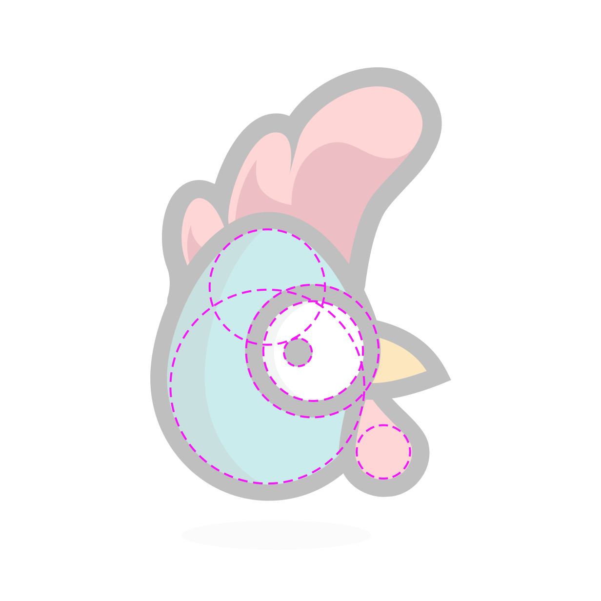
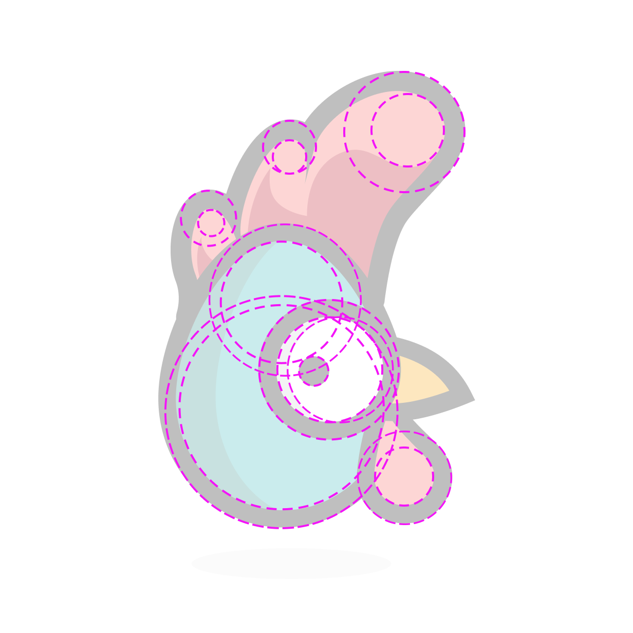
Rewst has been carefully constructed to provide personality and excellent visual clarity at all sizes. By following these guidelines, we ensure that he continues to be direct, clear, and impactful throughout his many uses.
Primary logo
The Rewst logo works best horizontally in full color on a white background. Additionally, the full-color logo can be used on our Rewst Teal background color and on dark backgrounds when the wordmark is applied in white.
Digital
Our primary logo shouldn’t be smaller than 100px in width.

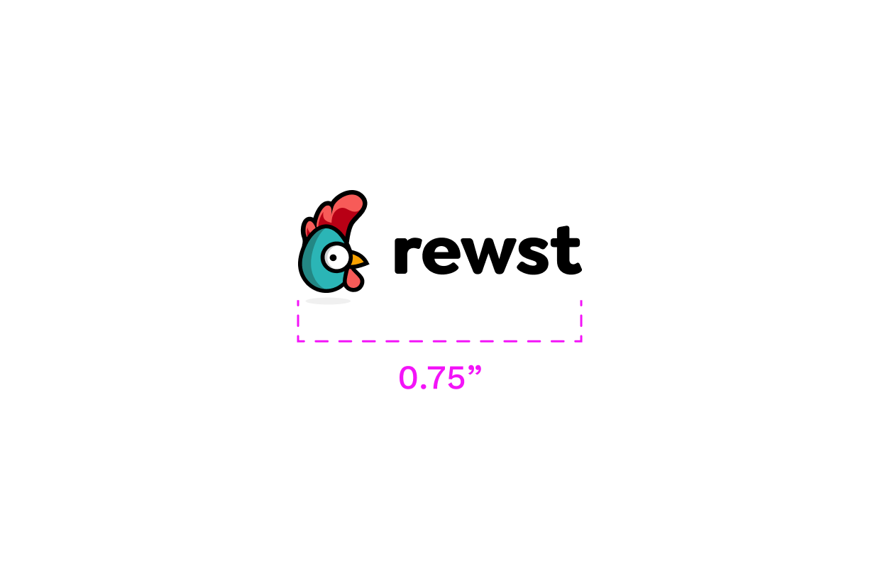
Printed, our primary logo shouldn’t be smaller than 0.75" in width.
Secondary logo
Our primary logo should be used whenever possible. In cases where the secondary logo fits better, it can be used sparingly. A good example of secondary logo usage would be the embroidery on one of our polos.
Digital
Our secondary logo shouldn’t be smaller than 75px in width.
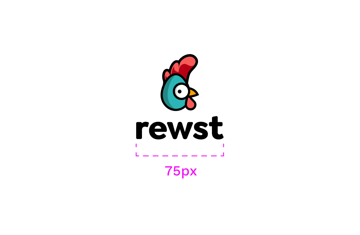
Printed, our secondary logo shouldn’t be smaller than 0.75" in width.

Rewsty logo
The Rewsty logo can be used in places where the primary logo is not needed or cannot fit because of size constraints. It is also used in social media avatars. Rewsty is the face of our brand. He works great in both large and small sizes and is often customized for events and holidays.



Digital
Our Rewsty logo shouldn’t be smaller than 18px in width.
Printed, our Rewsty logo shouldn’t be smaller than 0.25" in width.

Clearspace
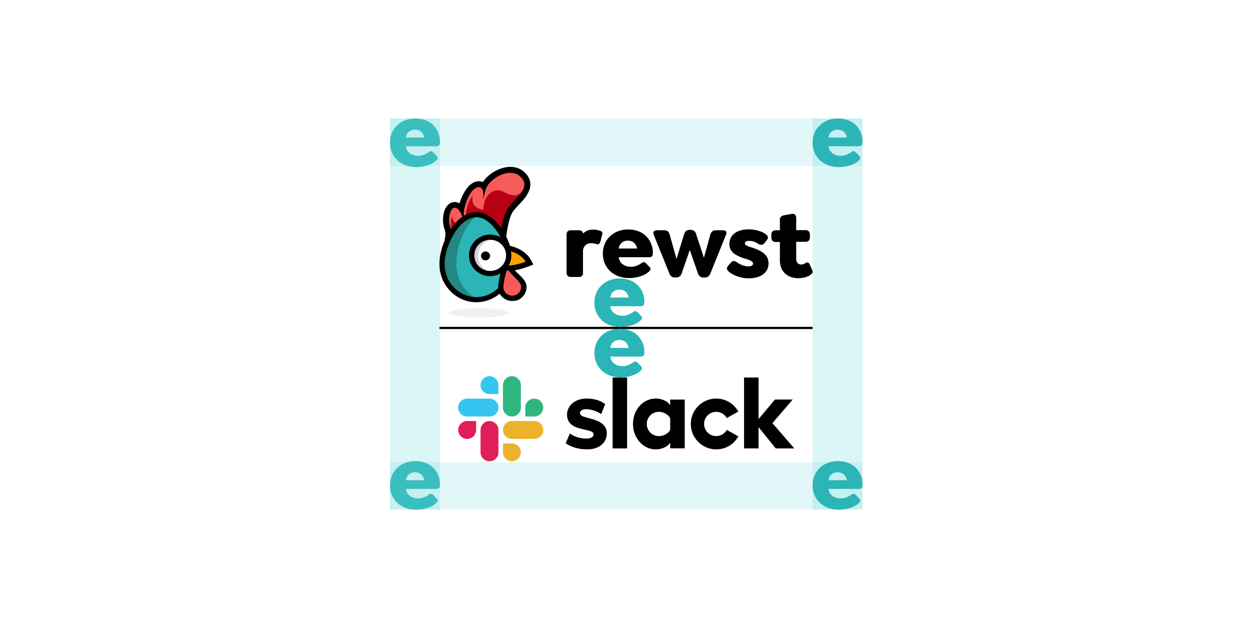
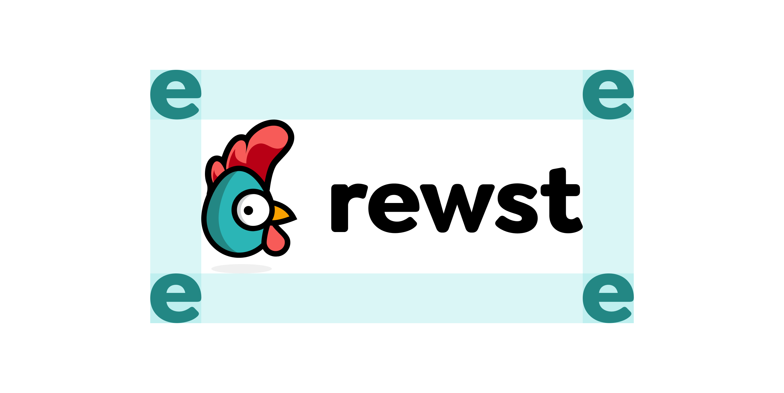
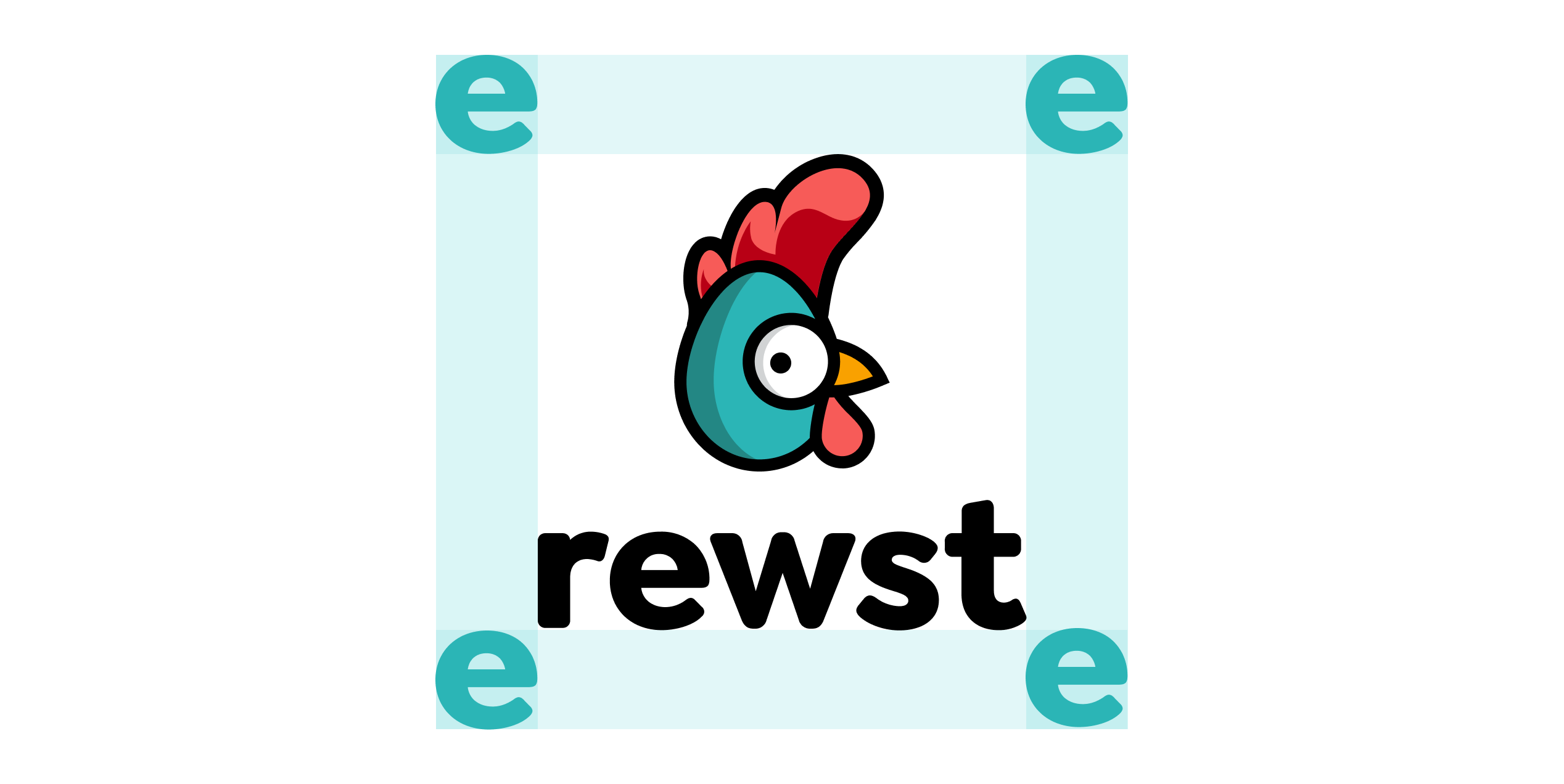
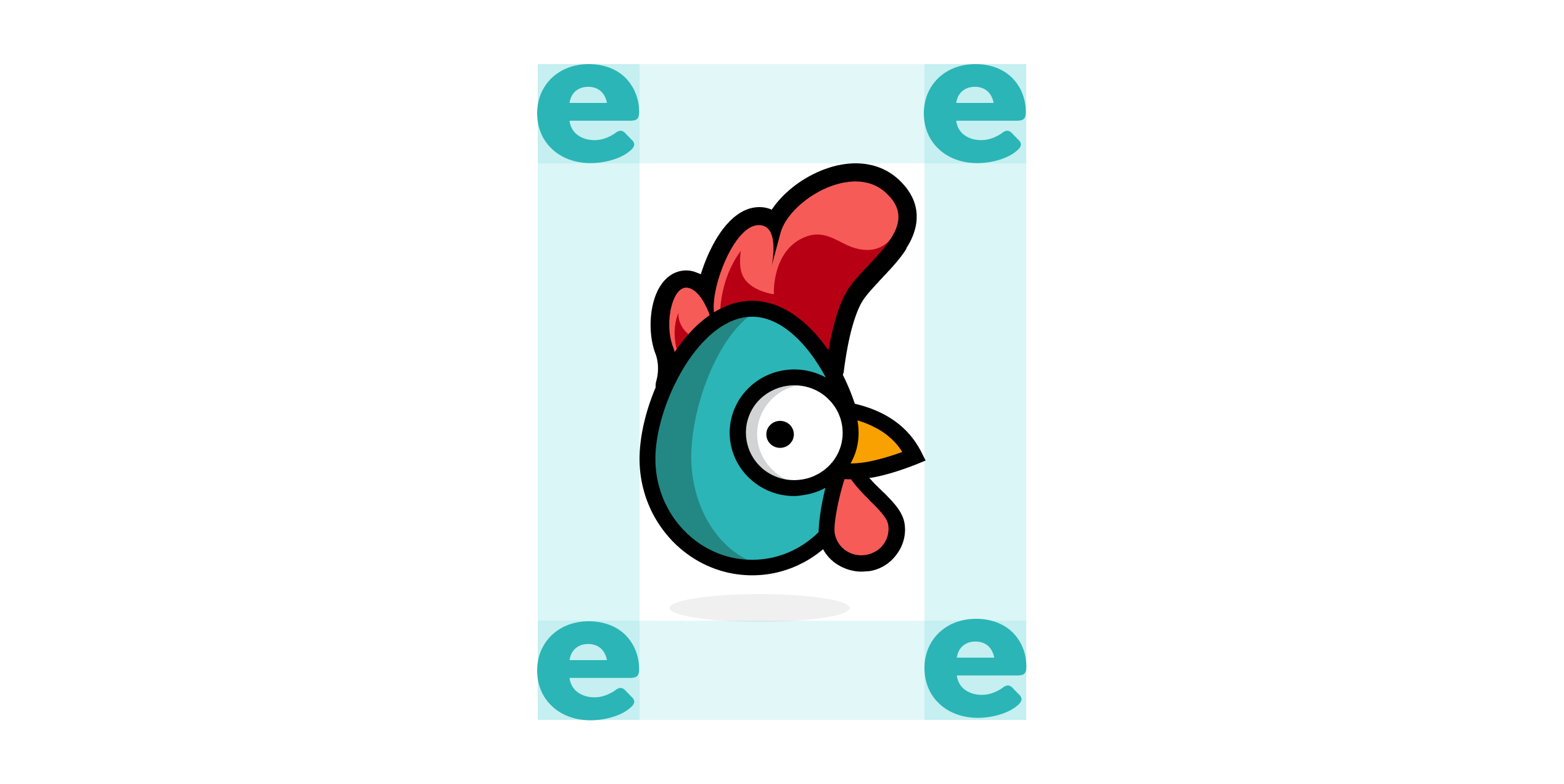
To ensure our logos are clearly visible, surround them with clear space that is free of type, graphics, and other elements that might cause visual clutter. Use the lowercase “e” of the Rewst wordmark to define the minimum clearance around the logo.
Logo lockups
Occasionally, we will need to display our logo alongside one of our partners. In these instances, we use a gray 1px divider and our lowercase “e” as a spacer. Our logo should always be shown first.

Logo abuse
To maintain the integrity of the Rewst logo, and to promote the consistency of the brand, please do not misuse it. Some examples of logo abuse are listed below.
Do not disproportionally scale the logo
Do not rotate the logo
Do not use the wordmark alone

Do not use our logo in grayscale
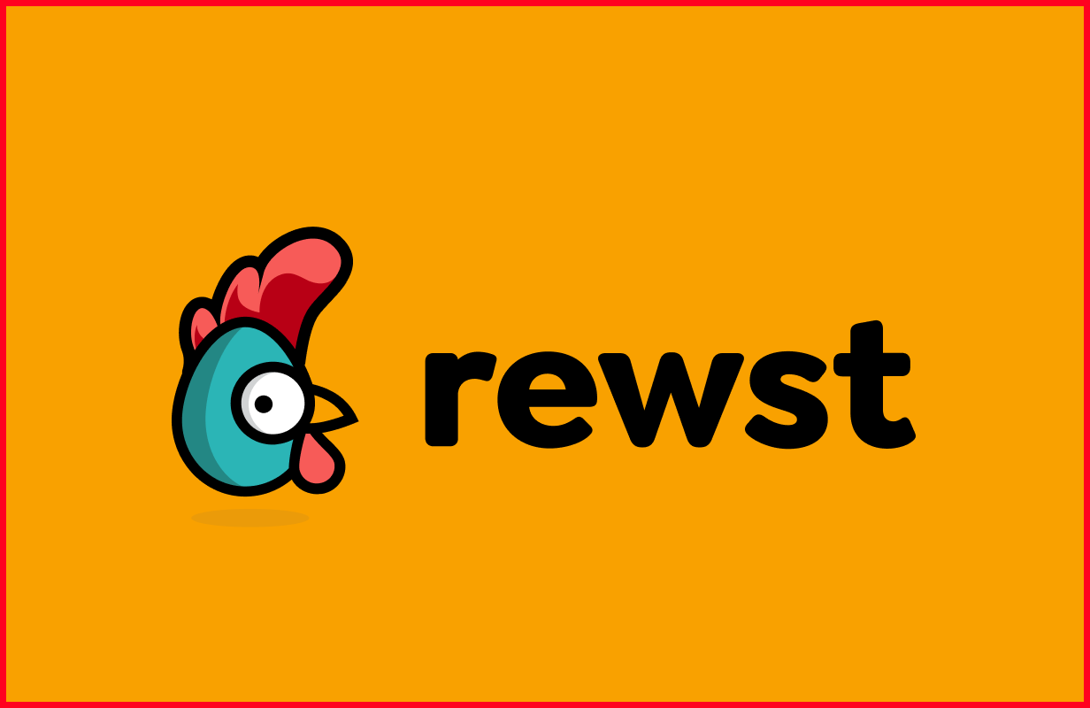
Do not use unapproved color combinations
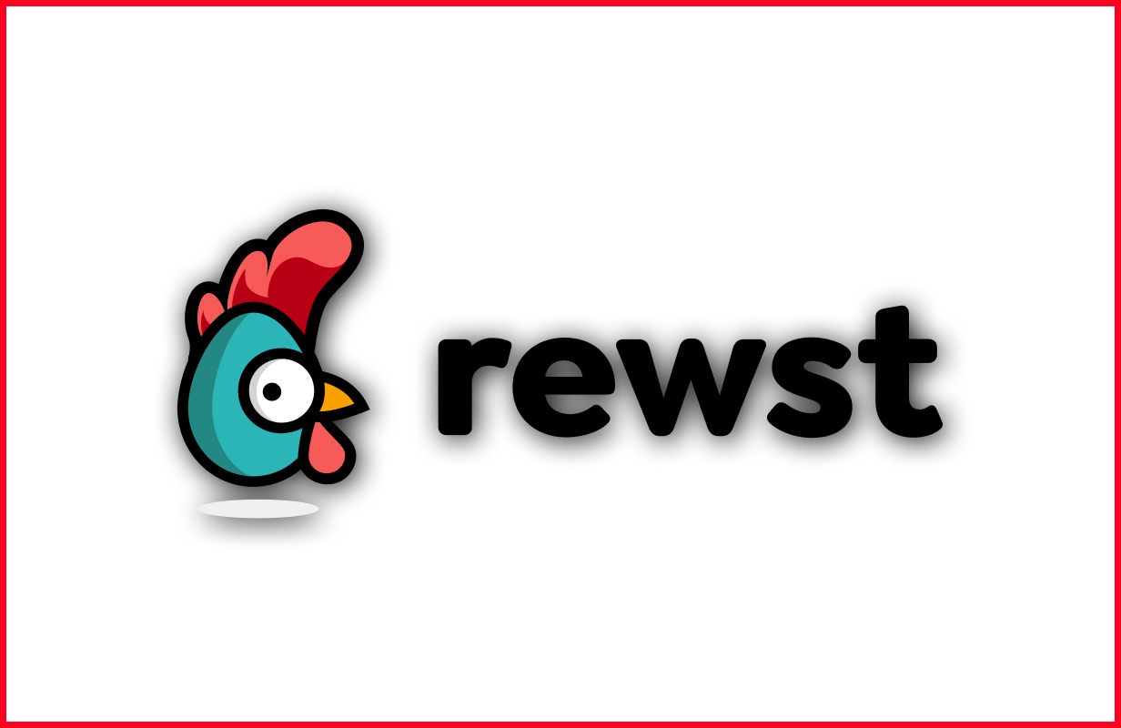
Do not use a drop shadow
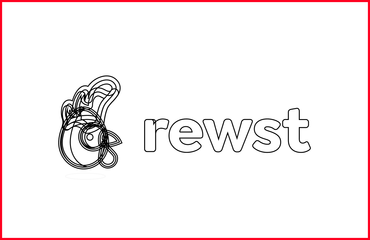
Do not outline the logo
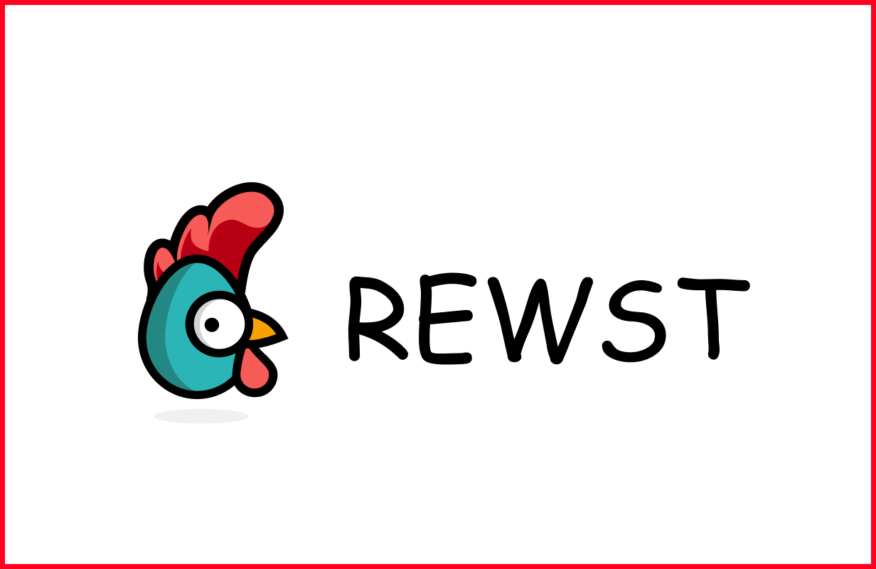
Do not change the font of our wordmark
Do not create your own versions
Do not pair a custom Rewsty with our wordmark
Monochrome logos
We love our primary logo, so that should always be used when possible. These monochrome treatments can be used as a substitute, but only when absolutely necessary.



Custom Rewstys
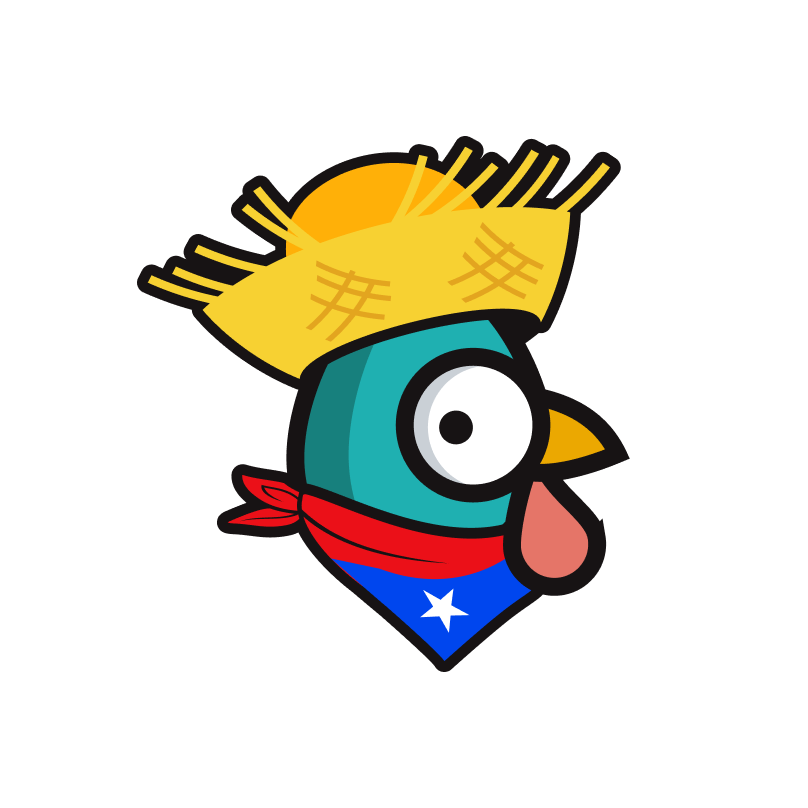
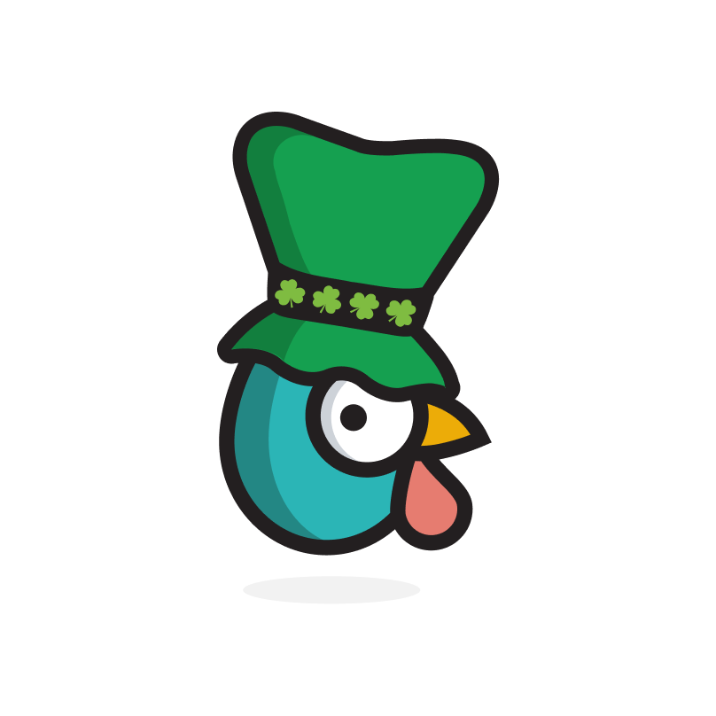
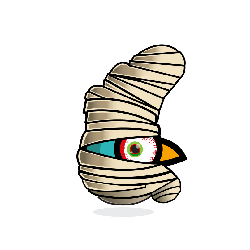
We have created several custom versions of our Rewst logo for social media, holidays, and events. These should never be used to replace our primary logo but can be used sparingly as part of a fun, approved environment.
Robo Rewsty

Nerdy Stewart

Agent Smith

Nerdy Stewart

Educated Stewart

Ponce De Leon Stewart

Puerto Rico Stewart
St. Stewart
Cinco de Stewart

Party Stewart

Pride Stewart

Kippah Stewart

Pandemic Stewart

Thankful Stewart

Halloween Stewart

Mummy Stewart
Christmas Stewart
