Rewst Styleguide
Typography
Overview
Typography plays a huge role at Rewst. It’s our vessel for us to speak both internally and externally. We rely on things like layout, color, and weight to create a hierarchy for our communications. Below you will find helpful guidelines around when, where, and how to use our approved typefaces.
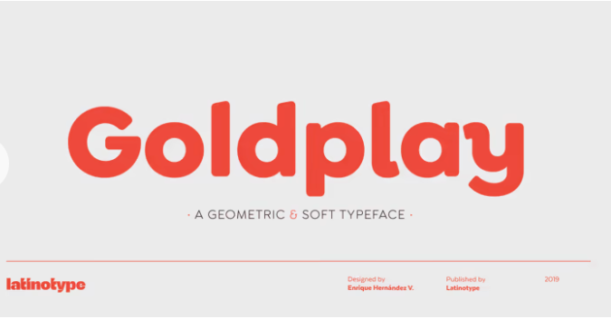
Goldplay
Goldplay Sans is our go-to for everything printed or delivered as an image. Goldplay Sans features rounded, soft terminals that give it a friendly, honest, clean look (but not too clean).
Use this for print materials.
- Banners and backdrops
- Swag
- Print ads
- Tradeshow handouts
- Banner ads
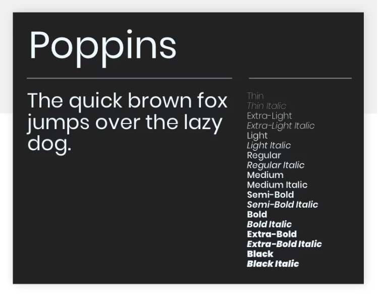
Poppins
Use Poppins for anything web-related other than static images. Examples include:
- Online documentation
- Landing pages
- Blogs
- Website pages
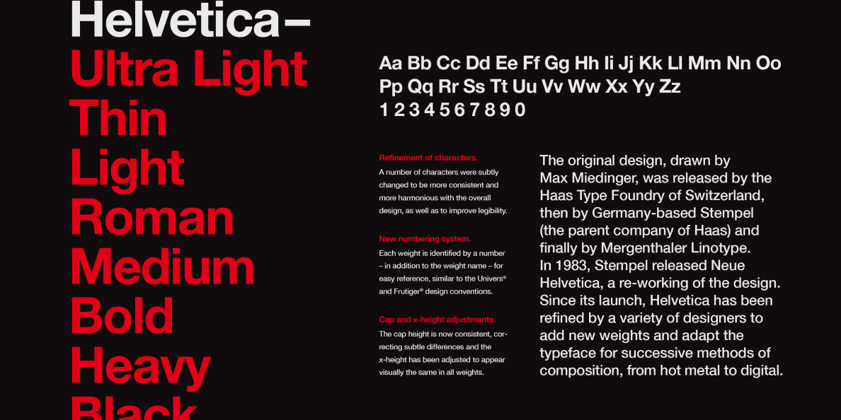
Helvetica
Use Helvetica for PowerPoint decks. Contact the Marketing team for an updated PPT Theme file, or for help using it to easily bring your PPT into the current look and feel.
Arial
Use Arial when no other typeface is available. For example:
- You have a PC and Helvetica is not rendering correctly on PowerPoint.
- You are creating internal documentation in Loop and can’t get Poppins to load.
Typography Guidance
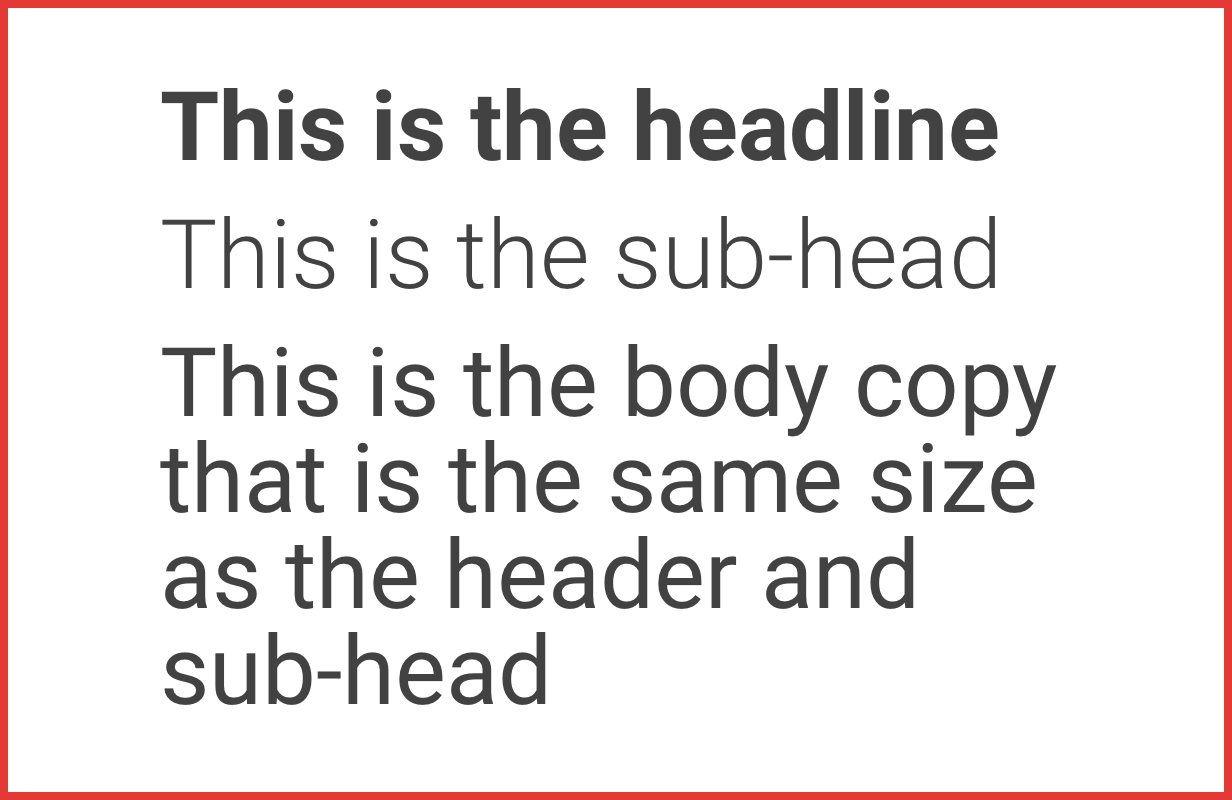
Do not make any level of hierarchy the same size or scale as another
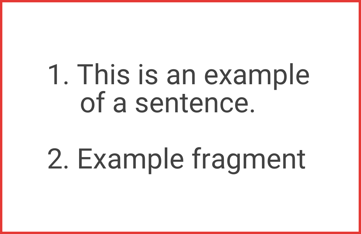
Do not use a mixture of sentences and fragments in bulleted or numbered lists. Sentences get punctuation. Fragments do not.
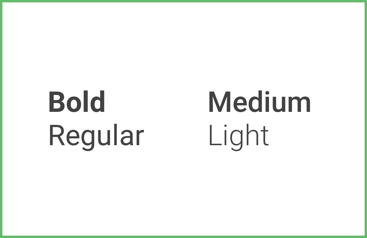
For proper contrast, make sure weights are at least 2 steps from each other
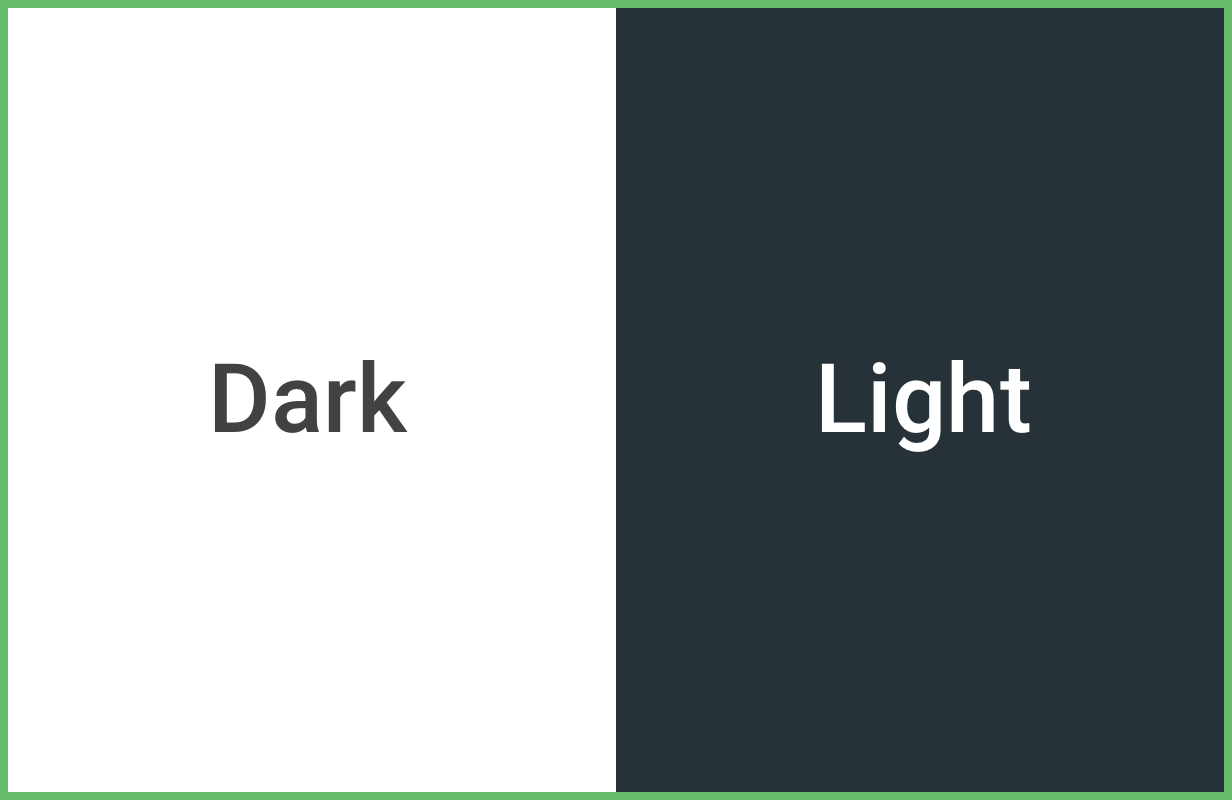
Use dark text on light backgrounds and light text on dark backgrounds

Hyphens are used in compound terms where an en dash should be used to span ranges of numbers
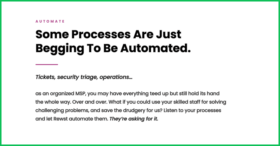
Typography use case
Typography styling and pairing using sentence case for heading.